If you look hard enough, every brand has a story. In previous topics, we discussed the proper ways to build a brand platform and help find your brand's authenticity. But whether your business is a product or service, it has great potential to brand a unique narrative through a fundamental touchpoint for your brand – your website's user experience.
One of the amazing things about front-end web development (and web design) is that you now have the ability to tell your story through an increasingly immersive experience. Web pages can be delivered to you bootstrapped with photos, videos, animations, sounds, 3-D effects, etc. But, one of the most eye-captivating animations is parallax scrolling.
Parallax scrolling gives you the illusion that there is more "depth" within a site. It typically occurs when the background image moves slower than the foreground images you are seeing. When designed well, this effect inevitably immerses the user in the web page and begins telling the story in a more compelling manner.
Best Practice Examples
If you are unfamiliar with parallax and its potential to tell a brand story, visit these best practice examples ranging across various industries and audience demographics.
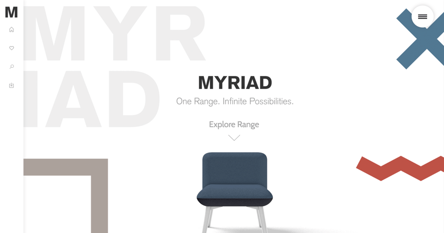
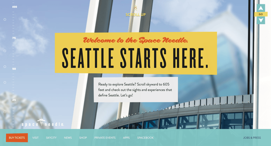
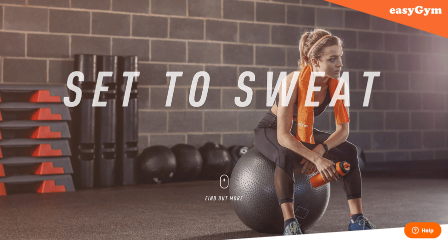
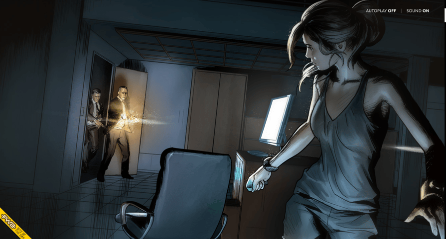
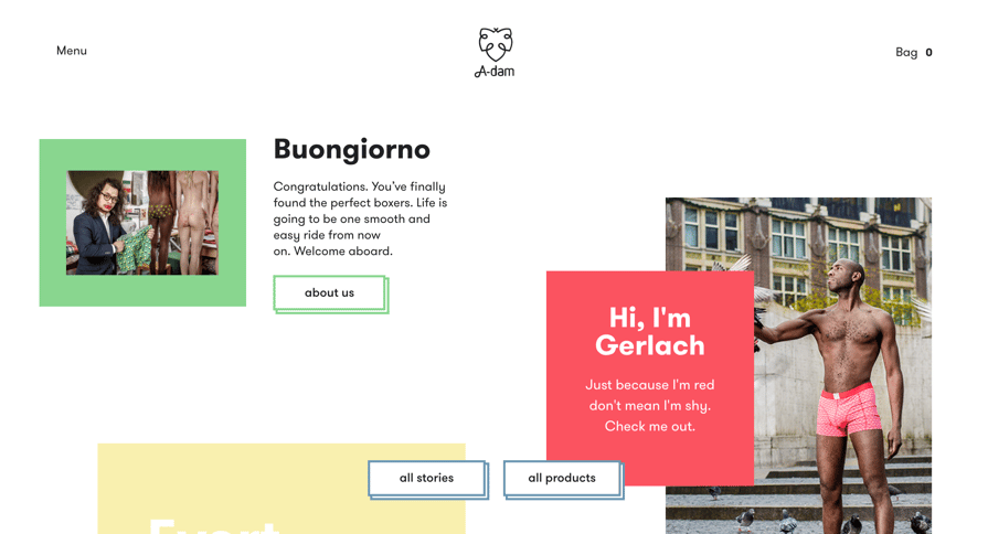
In all of these examples, the brands are using parallax scrolling in creative ways to deliver their story. Even if the narrative does not relate directly to the brand's positioning statement or their mission and vision, it engages the viewer to the point where they want to lean in and remain engaged with the content. This enhanced user experience paired with engaging design and animations compel you to reach deeper into the page, which of course is good for SEO, page rank, link authority, etc. In some cases, the parallax combined with the site's design, photography, and personality is so compelling that becoming an instant fan is unavoidable.
Warnings
So all of this sounds great, but if you are encouraging your web team or agency to move toward parallax as a design direction on your next project, be mindful that you are introducing many additional requirements and quality control issues that will come up, ultimately stretching the timeline and budget.
Another critical component to developing a parallax experience is to remember that every web visitor wants a smooth page experience. If overlooked, this simple requirement will be the equivalent of bad audio on a feature film, which of course, is the only thing anyone would notice. In other words, it is quite agitating when you come across a webpage, and you’re not able to scroll efficiently down the page or to figure out how to operate the parallax behavior because there are poorly timed animations or terribly executed scroll-jacking.
Finally, one last parting word of advice is to avoid developing a site that has an overly complicated parallax page and does nothing to convert your audience into customers. The goal is to keep customers on your site and provide meaningful content, so they often return, or engage long enough to become a customer.
Summary
When done properly, parallax is an incredibly effective way to encourage your audience to lean into your content and remain interested in your brand or product messaging. When a user arrives at your site they should feel like they are viewing more than just a web page – they should feel immersed in your story.
If you want more information on how to bring your site to life with parallax scrolling combined with the right design? We'd love to hear from you.


