Navigation menus are one of the most important parts of a website. The menu shows you the main sections of the site architecture and gives the primary direction on how to locate the key pieces of content on the site.
Your navigation menu, not only helps the user make their decision on where to go once they arrive on a web page, but also what is most important for their journey. In addition to having interesting navigation, you may also consider using parallax or other UI elements in your web design to enhance your brand's story through your website experience.
One of the most popular trends we have seen in web development and the design of navigation menus is the hamburger menu. The user interface of the hamburger menu is quite intuitive and it makes sense as a navigation system, especially on mobile. But aren’t there other ways? The answer is yes!
There are other slick, current and intuitive navigation styles that can be used for your web experience and on-line brand expression.
Key Examples
Here is an assortment of sites and apps that creatively and appropriately use a navigation UI other than the hamburger menu:

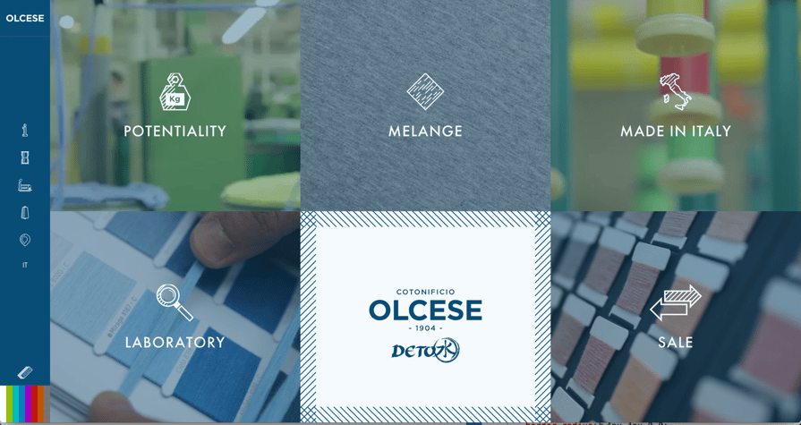
This site not only avoids using the hamburger menu in the desktop environment, but it has a full-screen navigation menu when you arrive on the site along with a static left-hand navigation bar. Site: Cotonificio Olcese

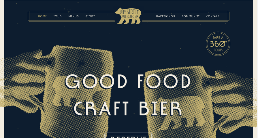
This site incorporates their branding directly into the navigation bar. Site: Bay Street Biergegarten

Instagram uses a fixed bottom navigation bar to give the user direction. This style of navigation is beginning to be used in many common apps, especially due to its proximity to the user's thumb.

This is a CodePen by Chris Kirsch of an interactive menu with icons. It’s a design that is playful, but still gets the job done. Demo: CodePen

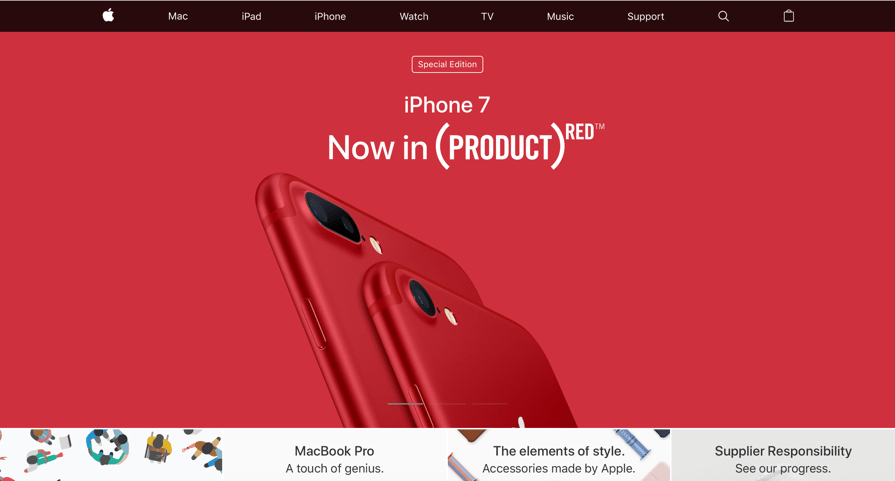
Apple does a great job of elegantly displaying its main areas. What’s great about this simple design is that the content is immediately visible. This is a timeless class and no user will ever be confused by a menu like this. Site: Apple
Main Idea
These are just a few examples of what is possible beyond the hamburger menu, and here are a few more. The point is that there are new and emerging design styles that can inspire you to think beyond traditional UI elements. Web and mobile viewers are more savvy now than ever before, and because of this you can push the unique and creative direction of your UI further than you (or your boss) may be comfortable.
You should still aim for simplicity and elegance in the navigation, because this will lend itself to a clean user experience overall, but don't be afraid to be clever or unique. If there is any concern over losing conversions or increasing your bounce rate, you should consider user testing, or A/B testing during fixed time frames.


