"The ideas presented in your copy should flow in a logical fashion (down), anticipating your prospects' questions and answering them as if the questions were asked face to face." – Joseph Sugarman
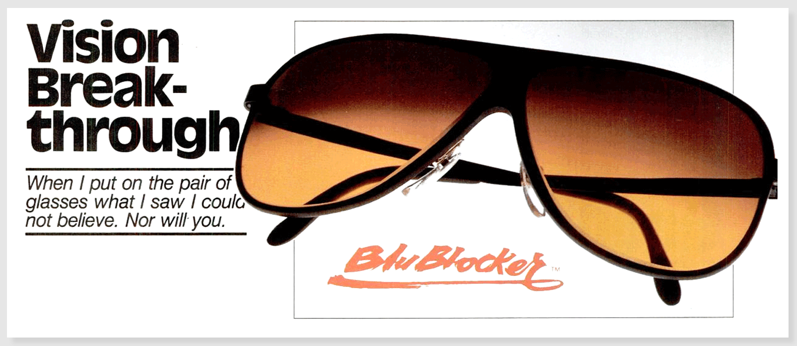
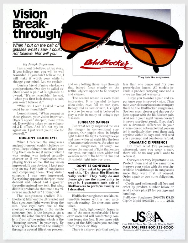
I recently finished reading The Adweek Copywriting Handbook by Joseph Sugarman, who was a top-class copywriter in the 80s and 90s. In the book, Sugarman shares his thoughts on writing great copy and describes his process in detail. For context, check out one of Sugarman's most well-known ads.

Fascinating, right? One of the questions that I kept asking myself while reading the book was, "Why is there so much copy? It's too much!" Days after finishing the book, it finally hit me...
This ad ran BEFORE the internet! The ads Sugarman shares were placed in magazines and catalogs across the United States in a time before the worldwide web, which in some ways makes the Handbook read more like a history book.
The BluBlocker ad was Sugarman's one chance to get a prospect’s attention, tell the brand and product story, and finally convince the reader to purchase.
Wild.
I often take for granted the fact that I can Google any product to get as much or as little information that I want. But in the 80s and 90s, these placements were not simply advertisements - they also acted like "analog landing pages." (Trademark pending.)
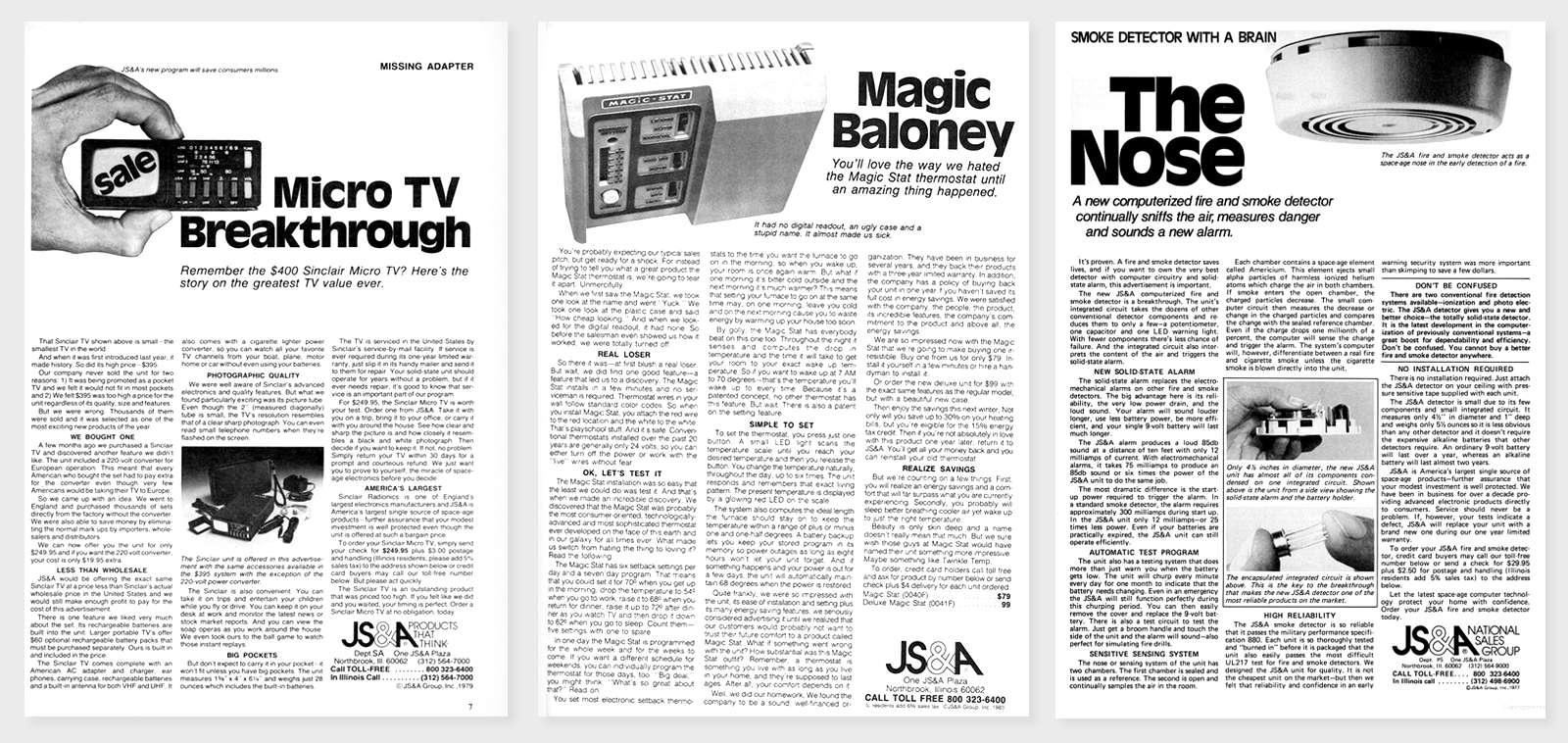
Take a look at the ad again. Or, look at the other Sugarman ads below.

There's an H1 and hero image, with clear sub-headline. The body copy is broken up with H2s, and at the end is a clear call-to-action.
Sounds familiar, right? The mediums change, but the principles of good design live on.
If you need help developing your next ad campaign, or producing award-winning ideas for your brand, feel free to connect with us.


